Tamales Sweet home is a new Mexican food business that came to the agency needing a digitized logo design.
The logo's sketch, and digitization process
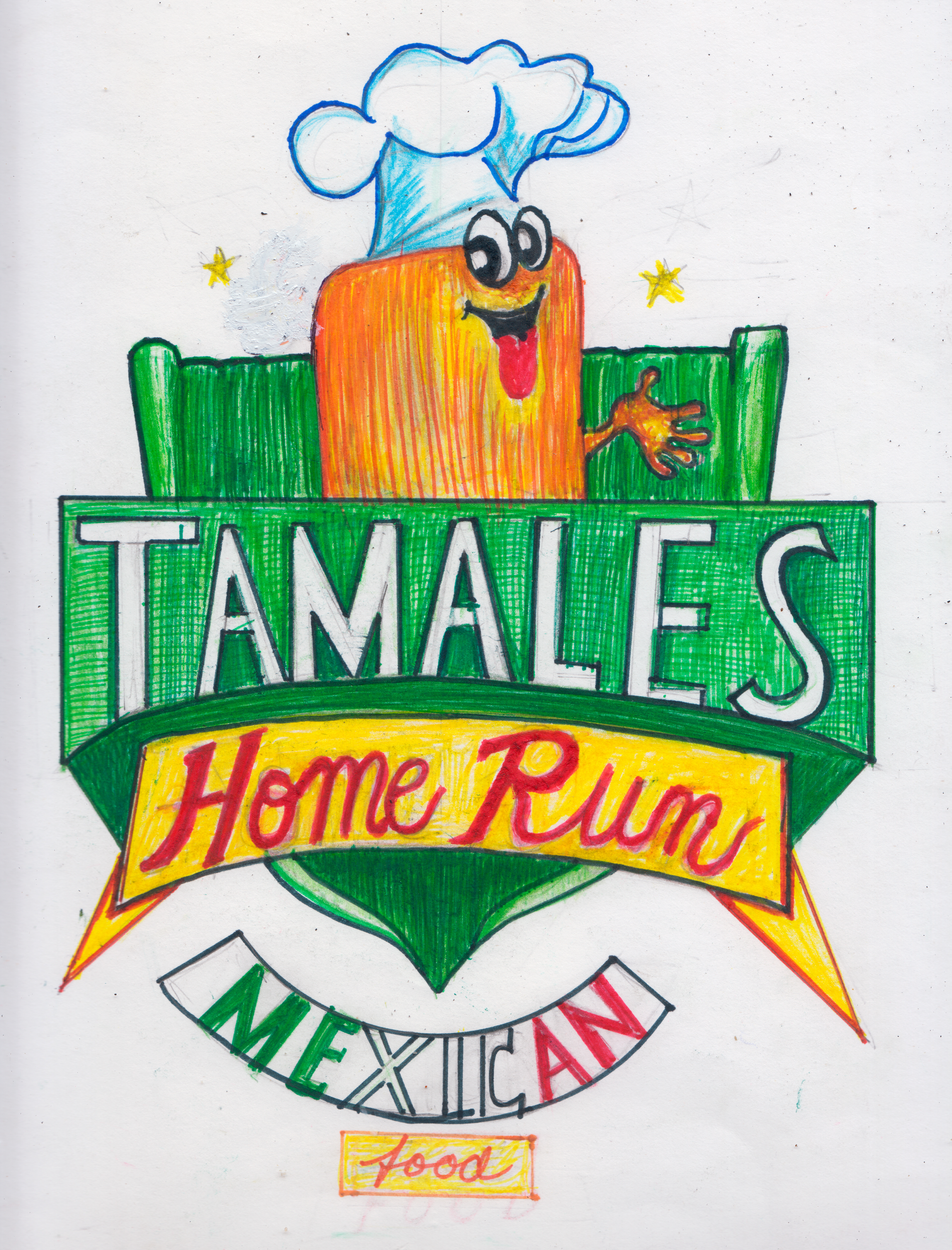
My boss handed me a sheet of paper with a drawing someone had made, about what they had envisioned for the brand. I opened Adobe Illustrator, and began the process of turning every bit of the drawing, into a vector graphic.

Changes made by the client
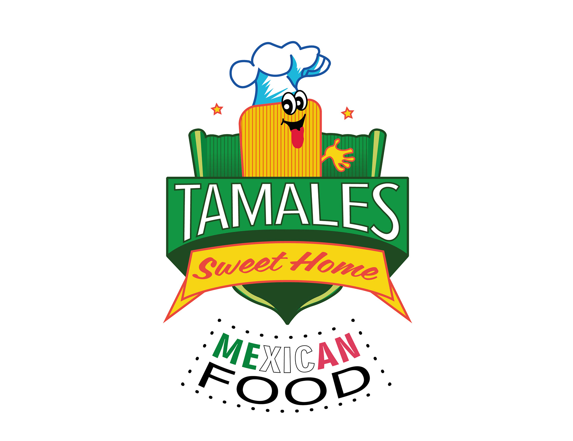
The client requested some changes from his original design. First, he changed the subheader from “Home Run” to “Sweet Home”. Then he modified how he wanted the “Mexican Food” bit to look.
Some creative decisions
Taking into account the characteristics of a “Tamal”, I created a pattern that would simulate the stripes of the wrapping, and the inside. I also added some gradients to give the logo some depth.
Three versions of the logo were made. They picked the third one shown below.
The main logo
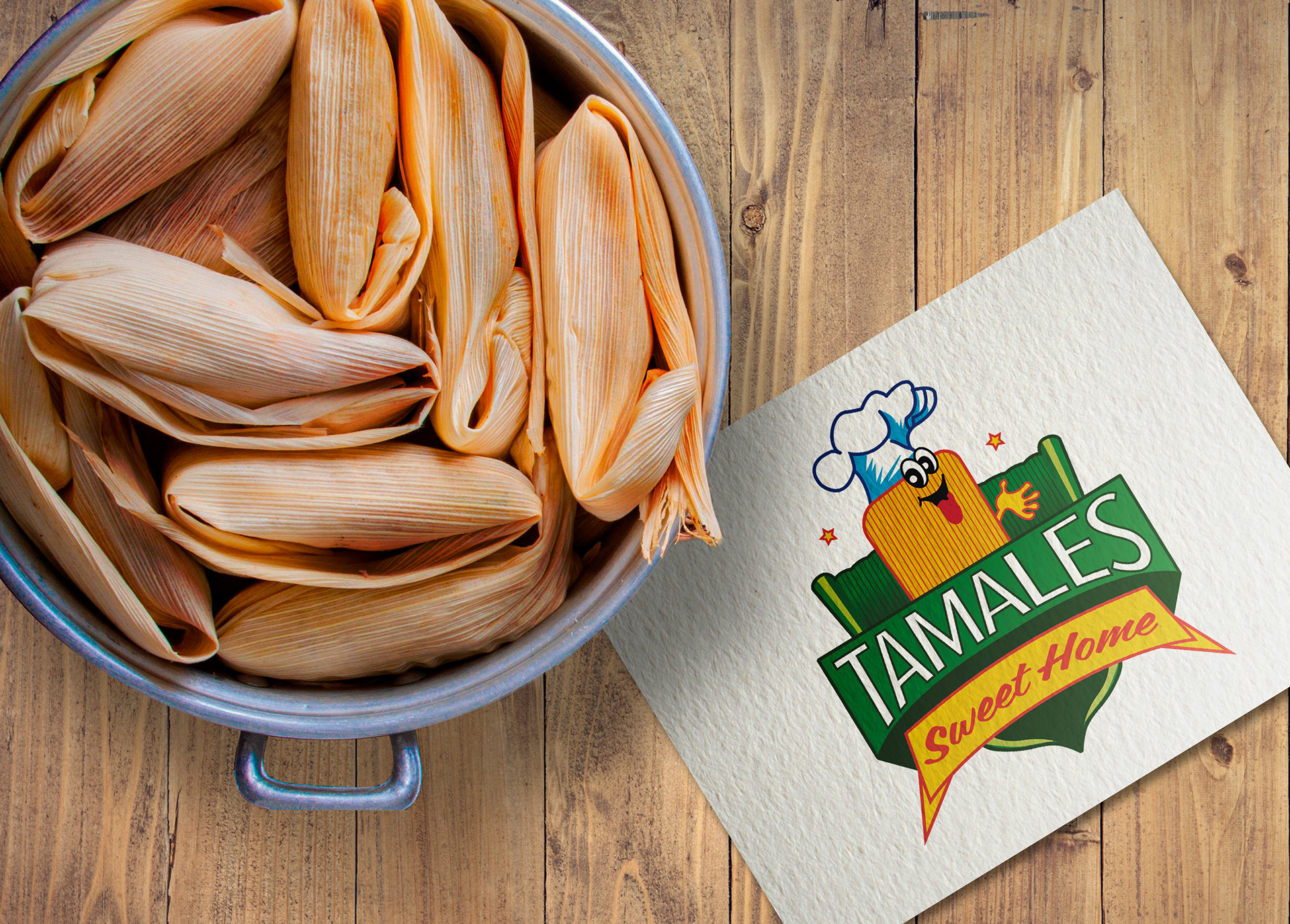
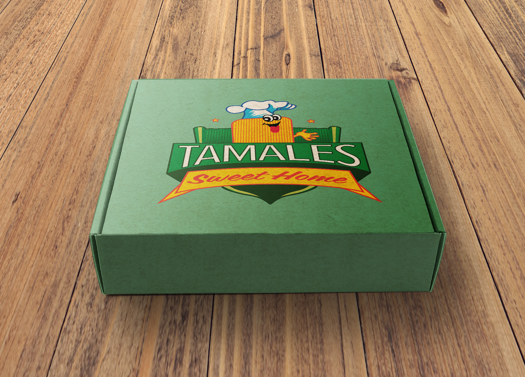
Although they had thought of including all the text within the logo at the beginning, they've used the "mexican food" element separately, placing it at the corner of an advertisement, for example. This left the rest of the graphic as the "main" logo. Below are some mockups I made to demonstrate how the logo would look on different objects, particularly, a napkin and a delivery box. This design is for the food industry, after all.
