Note: The base image for this mockup was not made by me. I made the logo and adapted it to the shirt in the image.
Concept
Photo Family is a new photography printing business, that came to me needing a logo design.
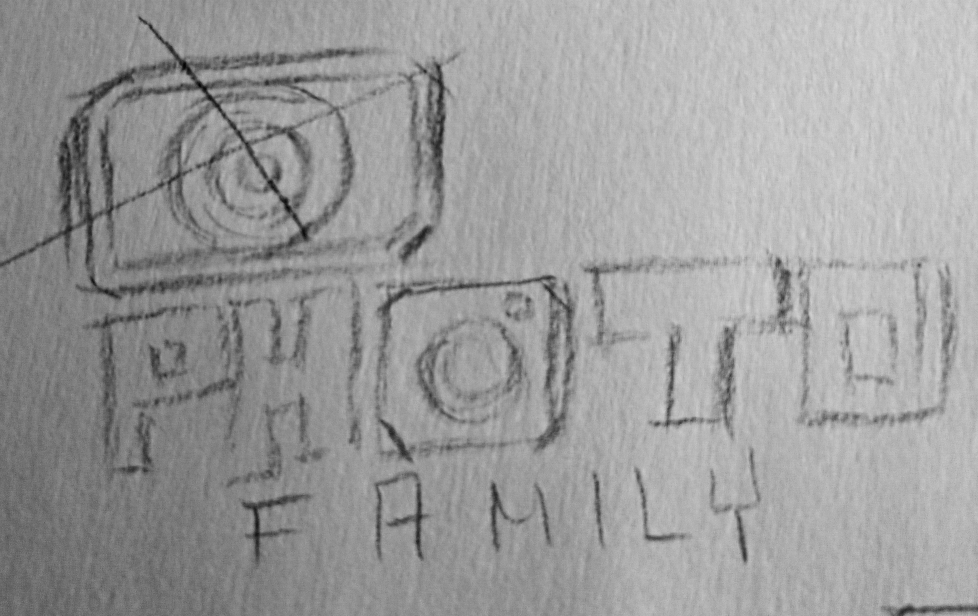
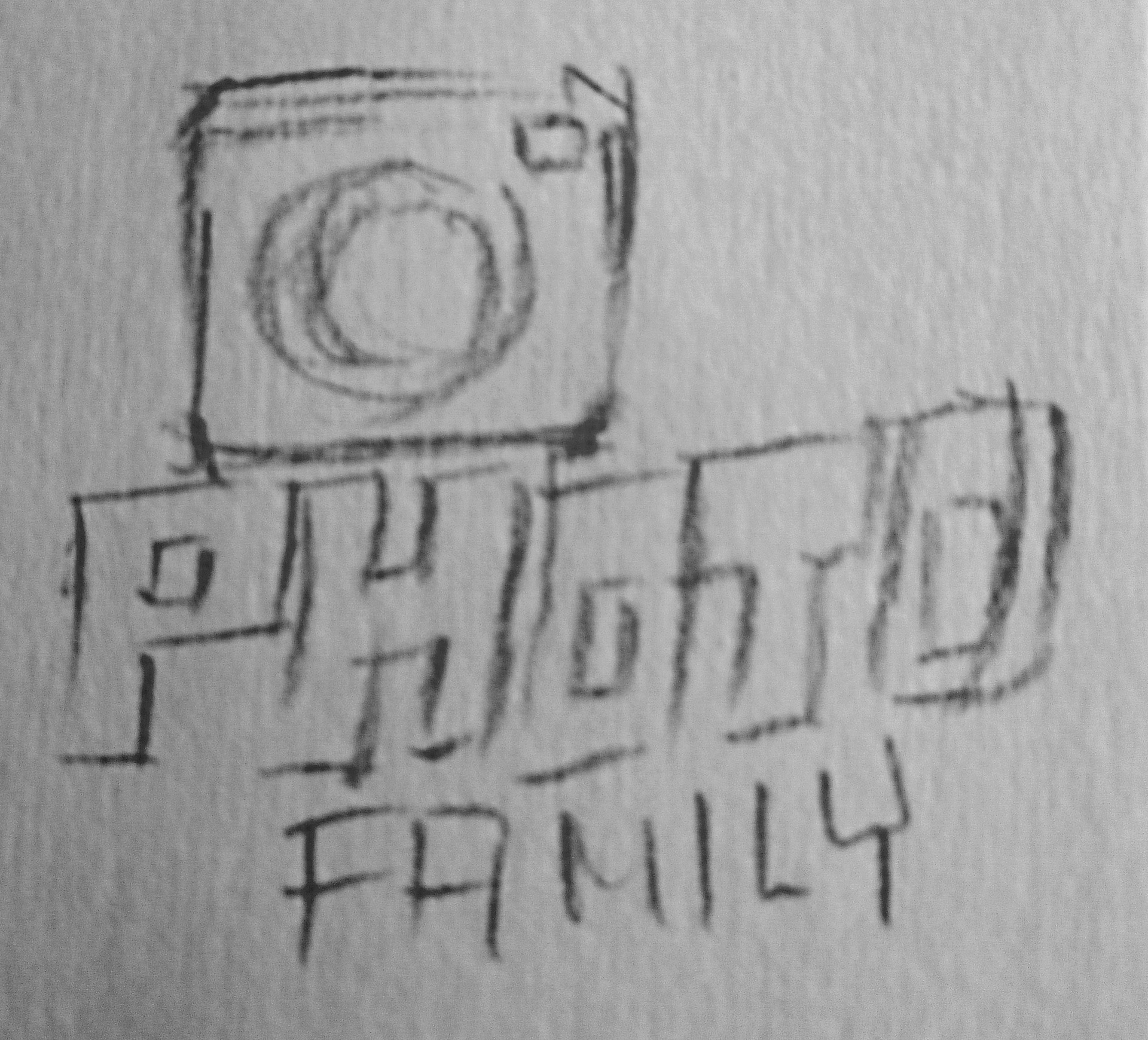
The client sent me a picture of the ideas he had for his logo.
Icon
Taking his sketch as inspiration, I created 2 possible icons for the "O", which he mentioned was to look "like a camera". He picked the second one.
Typeface and layout
With the icon chosen, I went ahead and picked an appropriate typeface. As you can see, I experimented with different placements for the words. I presented these options to him, and in the end, he chose the first logo, shown below.
Color choices
When asked about any preferred colors, the client told me he really liked how black looked. He said that black is commonly used in businesses related to photography. So we sticked to it.
